Every day, three times per second, we produce the equivalent of the amount of data that the Library of Congress has in its entire print collection, right? But most of it is like cat videos on YouTube or 13-year-olds exchanging text messages about the next Twilight movie.– Nate Silver
Airline Social Media Sentiments Dashboard in Tableau
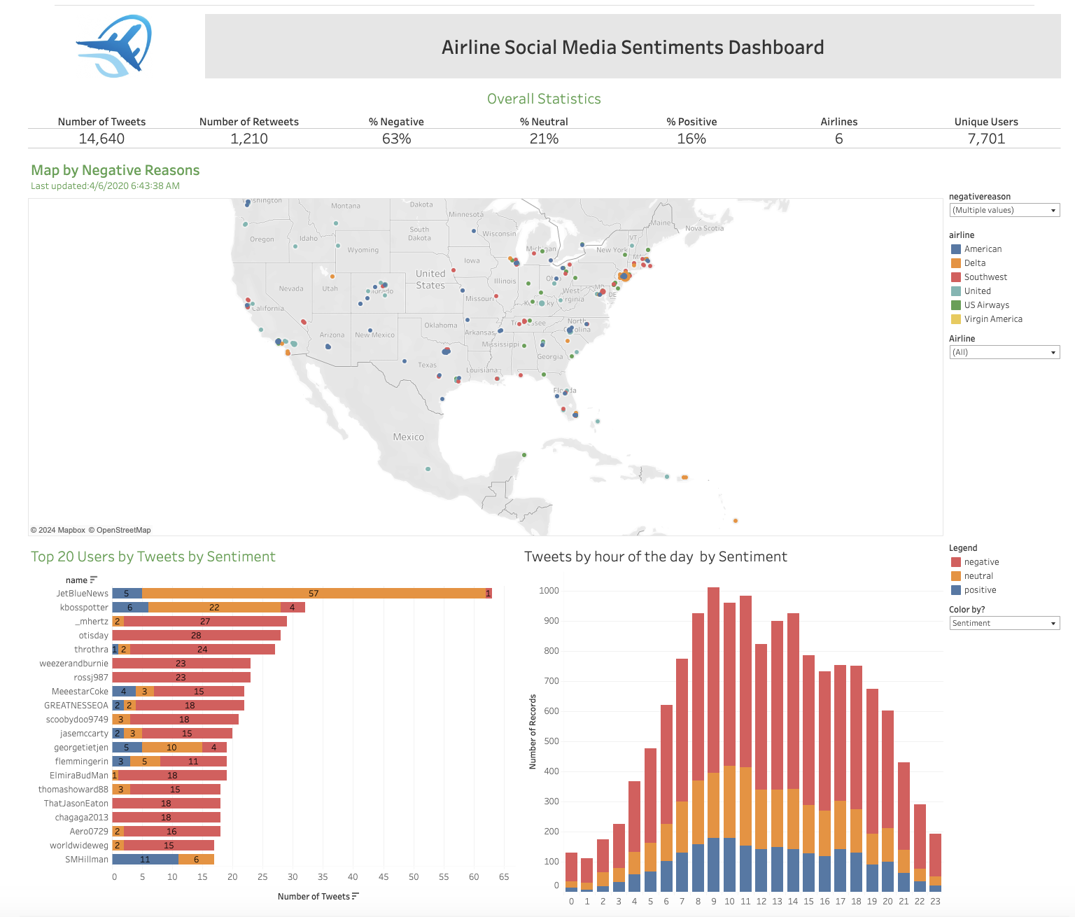
In the dynamic world of data analytics, the ability to transform raw information into actionable insights is paramount. Today, I'm thrilled to unveil my latest creation: the Airline Social Media Sentiments Dashboard, meticulously crafted using Tableau. This dashboard serves as a comprehensive tool for analyzing and visualizing sentiments expressed on social media platforms regarding six major airlines, providing invaluable insights into public perceptions and feedback.
Overview of the Dashboard
At its core, the Airline Social Media Sentiments Dashboard offers a holistic view of Twitter activity pertaining to American, Delta, Southwest, United, US Airways, and Virgin America. With data aggregated from 14,640 tweets, it provides a nuanced understanding of user sentiments, retweets, and unique users, painting a vivid picture of the online landscape.
Key Metrics
- Number of Tweets: 14,640
- Number of Retweets: 1,210
- Sentiment Breakdown:
- Negative: 63%
- Neutral: 21%
- Positive: 16%
- Airlines Covered: 6
- Unique Users: 7,701
These metrics offer a quick glimpse into social media activity surrounding the airlines, shedding light on prevailing sentiments and engagement levels.
Detailed Breakdown
Map by Negative Reasons
The interactive map is a centerpiece of the dashboard, visualizing tweets based on their negative reasons. By geographically mapping negative sentiments, it provides invaluable insights into regional trends and hotspots of dissatisfaction. Users can delve deeper by filtering the map to focus on specific airlines or reasons for negative feedback, enabling a nuanced understanding of sentiment dynamics.
Top 20 Users by Tweets and Sentiment
This bar chart presents the top 20 users based on the number of tweets they've posted, alongside the sentiment of their tweets. Notably, it highlights influential users and their impact on shaping online conversations. For instance, the presence of "JetBlueNews" with predominantly negative tweets underscores the importance of engaging with vocal users to manage brand perception effectively.
Tweets by Hour of the Day by Sentiment
The stacked bar chart unveils the distribution of tweets throughout the day, segmented by sentiment. By pinpointing peak tweeting times and sentiment distribution during those hours, it equips airlines with crucial insights for managing their social media presence. The noticeable spike in negative tweets around midday serves as a call to action, prompting timely responses and proactive reputation management.
Insights and Applications
Beyond showcasing proficiency in Tableau, the Airline Social Media Sentiments Dashboard offers actionable insights for airline companies:
- Identify and Address Pain Points: Proactively addressing common issues and enhancing customer satisfaction by pinpointing times and locations with the most negative feedback.
- Enhance Customer Engagement: Engaging with key influencers and addressing concerns directly to amplify positive experiences and mitigate negative sentiments.
- Monitor Social Media Trends: Staying ahead of emerging issues and trends by tracking tweet distribution throughout the day and enabling timely responses.
- Benchmark Performance: Comparing sentiment metrics across airlines to benchmark performance, identify areas for improvement, and inform strategic decisions.
- Drive Marketing Strategies: Informing targeted marketing campaigns and messaging strategies tailored to address specific customer concerns or sentiments.
Conclusion
In the digital age, social media shapes brand perception and customer satisfaction profoundly. With the Airline Social Media Sentiments Dashboard, I've demonstrated the ability to leverage Tableau to extract actionable insights and create compelling visualizations that drive informed decision-making.
As data analytics evolves, effective data visualization remains indispensable. By mastering tools like Tableau and honing storytelling through data, professionals can unlock new opportunities for innovation and impact in a data-driven world. The Airline Social Media Sentiments Dashboard stands as a testament to this ethos—a fusion of art and science, empowering organizations to navigate the complexities of the digital landscape with confidence and clarity.
Toptal skill reference:Data modeling analyst
Toptal skill reference:Data engineer